Alert
Alerts are use for showing small messages to user.
Avatar
Avatars displays the User's profile picture. It can be used on Navigation Bar, Social Media Handles, and Messaging platforms.
Rounded Avatar, Put your image in src.
Square Avatar, Put your image in src.
Badge
Badges are being used to display a notification count or status information, such as the number of messages or notifications.
Badge on icon
Badge on Avatar
Card
Cards can be usd as a container for containing multiple informations. It can contain headers, images, text and footers, background colors.
Text only card
Card
The Millionaire Fastlane is about getting wealthy and retiring in 10 years rather than 40 years.
Basic card with image
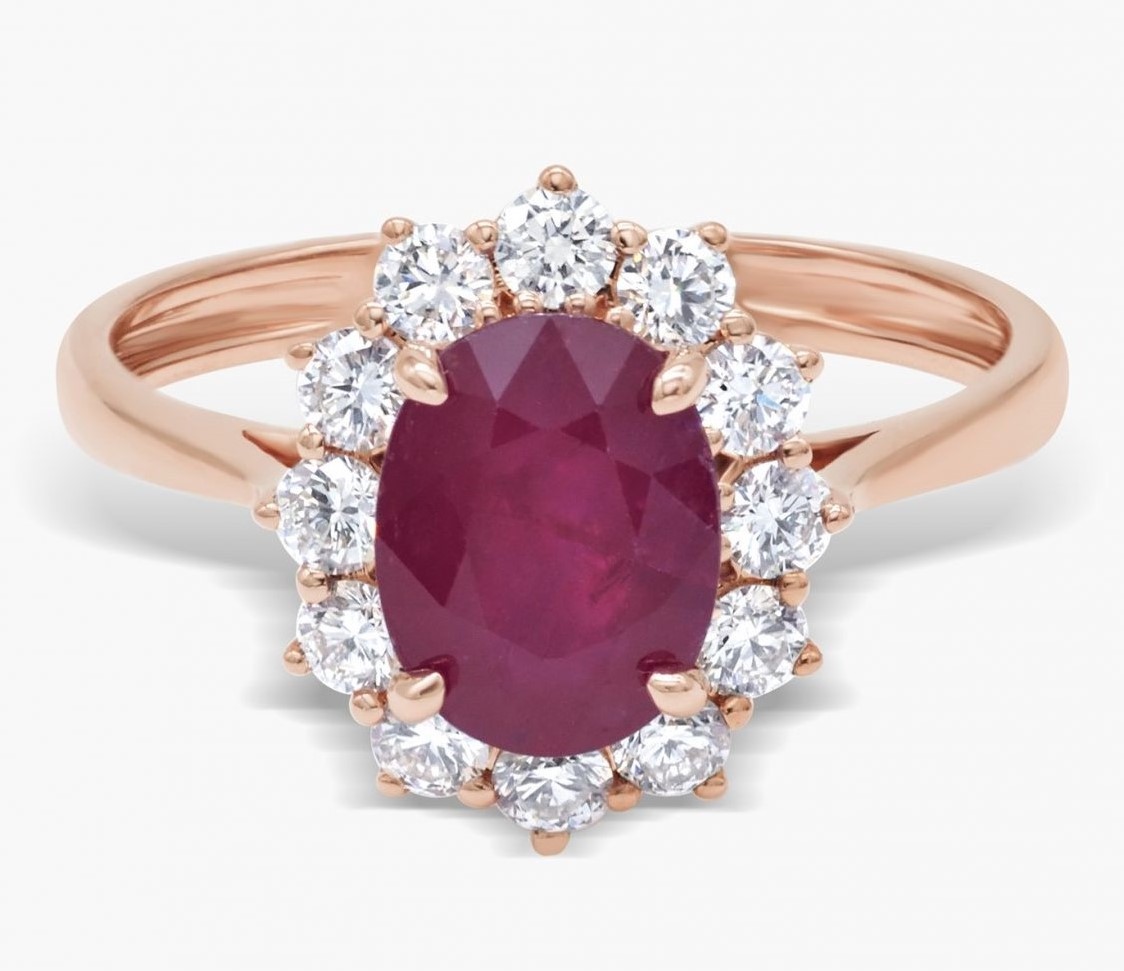
Classic Ruby Ring
₹46,838
Horizontal Card
Classic Ruby Ring
₹46,838
Card with Badge & Icon
Classic Ruby Ring
₹46,838
Classic Ruby Ring
₹46,838
Text Overlay Card
Classic Ruby Ring
₹46,838
Image
Responsive images can be use for profile picture and as a background.
Responsive Image
To make your image responsive add class name 'responsive-img'
Rounded image and Square image
for rounded image add class name to rounded, for square image add class name to square
Input
Input can be used to take information from a user. Listed below are the input fields having validation and styles.
Example of input
Error Input
List
List for use for listing elements.
Normal list
- First item
- Second item
- Third item
Stacked List
-
Person name
Person1@gmail.com
-
Person name2
Person2@gmail.com
Typography
Heading
H1 Heading
H2 Heading
H3 Heading
H4 Heading
H5 Heading
H6 Heading
For text alignment use text-left or text-center or text-right.
Left Text
Center Text
Right Text
Different size of text
Normal text
Small Text
Medium Text
Large Text
Extra Large Text
Gray text and Dark Gray text
Gray Text
Dark Gray Text